
MyCSUB updated interface: is newer really better?
October 9, 2022
We’ve all heard that newer is better but is that the case with the newly updated MyCSUB interface? Well let’s take a look and see what’s new and see if it has made students’ lives any easier. The update recently launched on Monday, September 26, 2022.
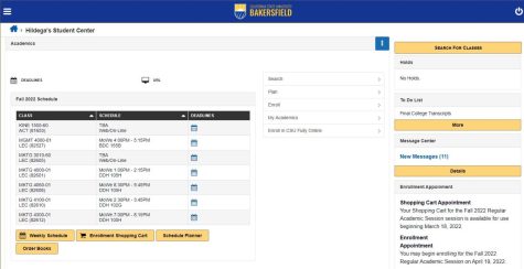
The new update comes with a brand-new logo and colors in hopes of being more aesthetically pleasing for students. The functions and features remain the same, with the overall layout feeling familiar, yet the functions have been moved around to create a cleaner and more responsive interface.
One of the significant changes coming from the update is the navigation and the introduction of the three-dash menu, which some experts also refer to as the “hamburger” menu icon. All the functions and links were spread out on the main page, but they have shifted into hamburger menus for students to maneuver around. Not to mention, a home button has now been added to every page the student is on.
Another critical change comes to the aid of mobile users with a new and improved interface for any student wishing to access their MyCSUB on their mobile devices. Instead of having to zoom in and click on the numerous links, much like a not-so-fun puzzle, the new update provides all the links in icons that students can now navigate to and from with a couple of clicks.
Brian Chen, Director of ITS Enterprise Applications and a team member responsible for the new update, is aware “a lot of students conduct pretty much all their business on their phone or tablet,” and the design was conducted and implemented with the “mobile in mind.” Chen continues by stating the old system was simply not responsive to all screen sizes, and it was quickly becoming outdated.
However, what will CSUB students think about the new update? Is it worth it? Did it help? Did they even notice?
Ruben Gladin, a junior at CSUB, calls the update a ten out of ten as he believes “the overall layout looks more neat, more uniformed [and] the tabs are great so much bigger and easier to find.” Gladin also describes the new interface as “very professional” and notices how the new color theme matches the school colors nicely.
At first glance, the new interface does appear to have a sleeker look by adding a nice burst of color. The old interface seemed dull, but we were used to it, which might be why some people dislike the update for now. The mobile-friendly update is noticeable and easier to navigate than what was once there. Now I can access MyCSUB easily on my phone without the headache of zooming and hoping to click the right link. That’s one area that the update definitely gets right.
It may be confusing at first trying to navigate through the new interface, but many students are familiar with the hamburger menu, so it shouldn’t take long for students to become familiar with the new interface. Brian Chen recognizes that “students are resilient and technology savvy” so students will really appreciate the new interface after a period of discovering and clicking around.
The update brings a touch of modernity yet remains true to what students already know. It doesn’t have to be a new idea completely; it just updates it to be more responsive. It may not always be true, but in this case, newer really is better.